Sign Your Brand: How Hand-Lettered Logos Became the Secret Weapon of America's Hottest DTC Labels
There was a moment — somewhere around 2014, give or take — when every new American startup started to look like a cousin of the last one. Muted palettes. Geometric sans-serifs. Loads of white space. The aesthetic was clean, confident, and increasingly... identical. Walk through any Whole Foods or scroll any Instagram shop and you'd swear the same design firm birthed every oat milk carton and vitamin subscription box in existence.
Fast forward to now, and something genuinely interesting is happening. A growing number of direct-to-consumer brands are tossing that playbook out the window and reaching for something far more personal: the handwritten mark. Not the faux-casual brush script you can download from a font marketplace, but real, considered, custom hand-lettering — the kind that takes weeks to develop and carries the actual fingerprints of a human being.
It's a shift that's reshaping how American designers think about brand identity, and the results are hard to ignore.
Why Minimalism Started Feeling Like a Liability
The irony of the minimalist brand era is that its biggest strength eventually became its biggest weakness. Clean design was supposed to signal sophistication and confidence. And for a while, it worked. But once every brand from artisan jerky to mattress startups adopted the same visual grammar, that confidence started reading as interchangeable.
Consumers — especially younger ones — got wise to what some designers started calling "blankface branding." The aesthetic was polished, sure, but it didn't tell you anything about who actually made the thing or why they cared about it. In a market flooded with options, sameness stopped being safe and started being a liability.
That created an opening. And type designers across the country started walking right through it.
The Human Mark as Competitive Advantage
Hand-lettering isn't new, obviously. It's been a cornerstone of American commercial art since the days of painted storefronts and circus posters. But its current resurgence in brand identity work feels different — more strategic, more intentional, and way more tied to the specific cultural moment we're living in.
For indie brands, a custom lettered logo does something a typeface simply can't: it communicates that a real person made a real decision about every curve and crossbar. That's not a small thing when your customer base has grown deeply skeptical of corporate polish.
Take a brand like a small-batch hot sauce company out of Nashville or a handcrafted candle line from the Pacific Northwest — the kind of labels you'd find at a local farmer's market but that now ship nationwide through a slick DTC operation. Their lettered wordmarks feel like a signature on a letter from a friend. They say we made this in a way that Helvetica simply cannot.
Lettering artist and brand collaborator Maya Solano, who works with emerging consumer brands out of her studio in Austin, Texas, puts it plainly: "Founders keep coming to me saying the same thing — they want their brand to feel like them. Not like a corporation pretending to be them. There's a massive difference, and customers can feel it."
The Craft Is the Message
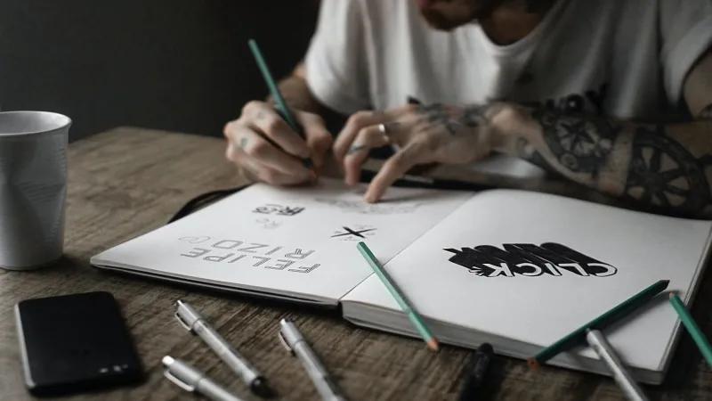
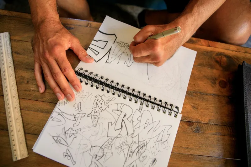
What makes this trend particularly compelling from a design perspective is how intentional the process has become. This isn't about slapping a quirky brush font on a label and calling it handmade. The brands that are genuinely breaking through are investing in the full custom lettering process — iterative sketching, refinement, sometimes months of back-and-forth between founder and designer.
That process itself becomes part of the brand story. Founders talk about it in their newsletters. They post in-progress sketches on social. By the time a logo launches, their audience has watched it come to life and feels invested in it.
New York-based lettering designer and IllustrationWeb community member Theo Wrangler describes it as "baking the story into the asset." He's spent the last three years working almost exclusively with DTC food and lifestyle brands, and he's seen the shift accelerate dramatically. "Two years ago I'd have one or two inquiries a month from brand founders," he says. "Now it's weekly. They're not just looking for a pretty logo — they want something that holds up as an artifact of the brand's origins."
Regional Identity Is Having a Moment
One of the more exciting dimensions of this trend is how hand-lettering is allowing brands to lean into regional American identity in ways that generic typography never could. Letterforms carry cultural memory. A slightly roughened serif with roots in Southern signage tradition reads differently than a loose, loopy script influenced by the Pacific Coast surf culture of the '70s.
Brands are using this deliberately. A small brewery in Appalachia might commission lettering that nods to hand-painted barn signs. A skincare line from New Mexico might draw on the bold, sun-bleached graphic traditions of the Southwest. This regionalism isn't just aesthetic window dressing — it's a genuine differentiator in a national market where so many brands have had their local identity smoothed out by design homogenization.
It also resonates with a consumer base that increasingly wants to know where things come from — not just physically, but culturally. Hand-lettering that carries regional visual DNA answers that question before a single word of copy is read.
The Challenges Are Real
None of this comes without trade-offs, and it's worth being honest about them. Custom hand-lettering is expensive and time-consuming. For a bootstrapped brand, committing to a weeks-long lettering engagement isn't always feasible. There's also the question of scalability — a highly expressive, idiosyncratic mark can be harder to adapt across packaging formats, digital applications, and merchandise.
And then there's the risk of the aesthetic itself becoming a trend — which, in some ways, it already has. As more brands pile onto the hand-lettered bandwagon, the same dynamic that made minimalism feel stale could eventually apply here too. The difference, arguably, is that genuine custom lettering has a built-in defense against copycat dilution: it's singular by design.
"A real custom lettered mark can't be replicated the way a Futura-based wordmark can," Solano notes. "You'd have to commission the same artist, and even then it wouldn't be the same. That uniqueness is the whole point."
What This Means for American Design Culture
Zooming out, this shift feels like part of something bigger happening in American visual culture — a collective hunger for the handmade, the personal, and the specific in the face of algorithmic sameness. Consumers are tired of feeling like they're choosing between interchangeable options. They want to feel a connection to the things they buy.
Hand-lettered branding is one answer to that hunger. It's not the only answer, and it won't be the right answer for every brand. But for the growing community of American designers working at the intersection of type, identity, and storytelling, it represents a genuinely exciting creative frontier.
In a market where attention is currency and trust is everything, signing your brand — literally — might just be the boldest move you can make.