More Is More: How Heartland Designers Are Blowing Up the Rules of American Visual Culture
For the better part of two decades, the loudest voices in American graphic design have come from either coast. New York's stripped-back editorial cool. San Francisco's clean, tech-forward minimalism. These twin poles have set the tone for what "good design" is supposed to look like — restrained, intentional, and allergic to excess.
Something different is happening in the middle of the country, and it's getting harder to ignore.
Out of cities like Chicago, Detroit, and Kansas City, a growing wave of designers is pushing back against the idea that less is always more. They're layering textures on textures. Stacking ornamental type on top of dense pattern fields. Pulling from quilting traditions, factory signage, Great Lakes folk art, and the visual noise of industrial Americana — and turning all of it into work that feels genuinely new. Call it Midwest Maximalism. It's not a trend in the Instagram-cycle sense. It's more like a correction.
Where It's Coming From
You can't fully understand this movement without understanding what these cities carry in their bones. Detroit didn't just build cars — it built a visual culture around manufacturing pride, union identity, and the kind of hand-lettered signage that once covered every storefront on Gratiot Avenue. Chicago has always been a city of architectural swagger and neighborhood-level hustle, where Polish bakery window art coexists with some of the most technically ambitious studio work in the country. Kansas City, often overlooked in national design conversations, has quietly developed one of the most distinctive illustration communities in the US, shaped by a deep tradition of printmaking and a thriving independent publishing scene.
Designers working in these environments aren't rebelling against minimalism for the sake of shock value. They're drawing from what's actually around them — the density of urban texture, the richness of regional craft, the visual generosity that working-class American design has always had before the industry decided to sand it all down.
Pattern as a Power Move
One of the most consistent threads running through this aesthetic is the use of pattern — not as background filler, but as a structural element. We're talking about dense, interlocking repeat motifs that feel almost textile-like, borrowed from traditions as varied as midwestern quilting, Pennsylvania German folk decoration, and the kind of ornate border work you'd find on vintage seed catalogs from Ohio or Indiana.
Where coastal design tends to treat pattern as decoration, heartland designers are using it as a statement. The message is something like: abundance is not a design flaw. Complexity is not clutter. There's a real confidence in work that refuses to leave breathing room, that trusts the viewer to sit with visual density rather than needing everything simplified down to a single focal point.
This approach is showing up in everything from brand identity work to editorial illustration to packaging design. A Kansas City-based studio might develop a brand system for a regional food company that's built entirely around layered botanical patterns and hand-rendered type — work that would read as "too much" by the standards of a Pentagram pitch deck, but that lands with incredible warmth and specificity for an audience that actually lives in that cultural context.
Color Without Apology
If you spend any time scrolling through the portfolios of designers working in this vein, the color will hit you first. These aren't the muted earth tones that dominated American design through most of the 2010s, and they're not the neon-soaked maximalism of Y2K revival either. This is something more considered — rich, saturated, historically informed.
Think deep terracottas and factory-floor greens. Mustards that reference grain elevator signage. Blues that feel like they were pulled from a Detroit Tigers pennant or a vintage Michigan travel poster. The palette choices often feel regional in a way that's almost geographic — like you could identify the city of origin from the color story alone.
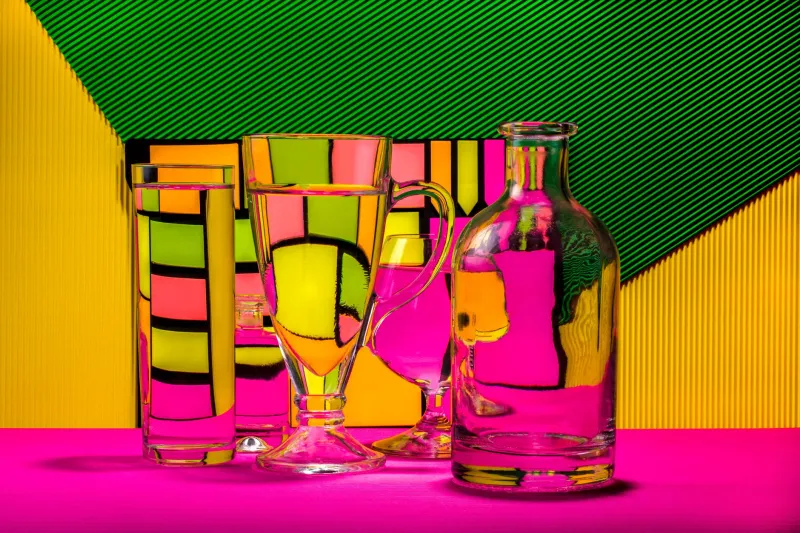
There's also a notable willingness to put colors together that contemporary design conventions would flag as problematic. High-contrast combinations. Warm-on-warm pairings. Triadic schemes that shouldn't work but do, because the underlying craft is strong enough to hold them together.
Getting National Attention
What's interesting is that this work isn't staying regional. Brands and agencies on both coasts are starting to seek out studios and freelancers embedded in this scene, partly because the work is genuinely distinctive, and partly because there's a growing cultural appetite for American design that feels like it comes from somewhere real.
There's a broader conversation happening right now about authenticity in visual culture — about whether the globalized, algorithm-optimized sameness of a lot of contemporary design is actually serving anyone well. Midwest maximalism offers a compelling counter-argument. This is design that's rooted in place, shaped by specific histories, and visually generous in a way that invites people in rather than holding them at arm's length.
Editorial clients, in particular, are responding. Long-form publications looking for illustration that carries genuine cultural weight are increasingly turning to artists from this ecosystem. The work holds up at large scale. It rewards close looking. It has layers — literally and figuratively.
What It Means for American Design
It would be easy to frame this as a regional story, a nice feature about creative communities outside the major design hubs doing interesting work. But what's actually happening feels more significant than that.
Midwest maximalism is forcing a real conversation about whose aesthetic values have been setting the default settings for American graphic design, and whether those defaults have been serving the full range of what this country actually looks like and feels like. The minimalist tradition has genuine strengths — clarity, focus, elegance. But it also carries cultural assumptions about what sophistication means, assumptions that have often worked to marginalize design traditions rooted in working-class, immigrant, and regional American culture.
The designers pushing this movement aren't interested in replacing one orthodoxy with another. They're interested in expanding what American design is allowed to be. More color. More pattern. More texture. More history. More of everything that got edited out in the long march toward clean and simple.
If the coasts built their reputations on restraint, the heartland is building something on the opposite principle — and right now, it's one of the most exciting things happening in American visual culture.