Beyond Blush: The Bold New Color Stories Taking Over American Design Studios in 2024
Let's pour one out for millennial pink. For a solid decade, that dusty, Instagram-filtered blush tone showed up everywhere — from brand identities to packaging to interior design. It became shorthand for a certain kind of approachable, feminine-coded aesthetic that, for a while, felt fresh. Then it felt ubiquitous. Then it felt exhausting.
American designers have moved on. And where they've landed is genuinely surprising.
Earth Tones Get Loud
The most dominant shift happening in US design studios right now is what you might call "maximalist earth." Think terracotta, burnt sienna, warm ochre, and deep forest green — but used with confidence and contrast rather than the muted, spa-day restraint that characterized the last wave of natural-toned design.
This isn't your grandmother's earth palette. It's saturated, layered, and unapologetic. Designers are pairing raw umber with electric chartreuse. Deep clay is showing up next to dusty violet. The combinations feel almost painterly — which is exactly the point.
"There's a real appetite right now for color that feels like it has weight," says Denver-based brand designer and illustrator Cassandra Ruiz, whose recent client work has leaned heavily into warm, mineral-inspired tones. "People are tired of palettes that feel weightless and forgettable. They want something that feels like it was made by a human who made a decision."
The psychology behind this shift tracks. After years of clean, minimal, Scandinavian-influenced design — all white space and barely-there pastels — there's a collective hunger for warmth and substance. Earth tones deliver both. They read as grounded and trustworthy while still allowing for creative expression.
Americana, Reconsidered
Another major thread running through 2024's American design palette is a nostalgic, but not kitschy, return to classic Americana hues. We're talking about the faded red, worn navy, and aged cream that you'd find on a vintage baseball card or a 1950s roadside diner sign — but filtered through a contemporary design sensibility.
This isn't the flag-waving, Fourth-of-July version of American color. It's more nuanced than that. It's the color of old typography, of sun-bleached signage, of things that have been around long enough to earn some character.
Seattle illustrator and graphic designer Marcus Holden has been exploring this territory in a series of editorial pieces he's been developing throughout the year. "I'm drawn to the idea of colors that feel like they've lived somewhere," he says. "Not artificially aged, but genuinely referencing a visual history that's specific to this country."
Holden's work uses a palette of dusty red, faded gold, and warm off-white that feels simultaneously retro and contemporary — a balance that's proving popular with clients in the food, beverage, and lifestyle sectors.
The Unexpected Rise of Warm Greens
If there's one color family that's had a breakout year in American design, it's green — specifically the warmer, yellower side of the spectrum. Olive, sage, moss, and avocado (yes, avocado is back, and it's better this time) are appearing across brand design, illustration, editorial work, and digital interfaces.
What's driving it? Partly, it's a natural counterweight to the maximalist earth trend — greens ground a palette and give it breathing room without going cold. Partly, it's a continued cultural interest in environmental themes and natural aesthetics. And partly, it's just that warm greens are genuinely versatile in a way that few other colors are.
"Green is the color I reach for when I want something to feel alive," says Atlanta-based illustrator Priya Nair, who creates lush, botanically inspired digital pieces that have been featured in several major editorial publications. "It has energy without being aggressive. It feels optimistic."
For designers looking to incorporate warm greens into their own work, the key is in the undertone. Yellow-leaning greens (think sage, olive, chartreuse) read as warm and approachable. Blue-leaning greens (teal, hunter, forest) read as cooler and more authoritative. Knowing which energy you're going for will determine which direction to pull.
Dark Mode Gets a Personality
Something interesting is also happening on the darker end of the spectrum. Deep, rich backgrounds — midnight blue, near-black plum, dark espresso brown — are showing up with much more frequency in American digital design, and they're being used in ways that feel expressive rather than just dramatic.
This is partly a reaction to the overwhelming dominance of white-background design that has characterized so much digital work for the past decade. Designers are realizing that a dark ground can make color pop in ways that white simply can't. Bright illustration work placed over a deep navy or chocolate brown background creates an almost jewel-like quality that's visually arresting.
"I started doing more dark-background work last year and it completely changed how I think about color relationships," says Minneapolis illustrator and motion designer Theo Vance. "When you flip the ground, everything you know about contrast and hierarchy gets recalibrated. It's a great exercise."
Practical Guidance for Working Designers
If you're looking to update your own color approach based on what's happening across American design right now, here are a few concrete directions worth exploring:
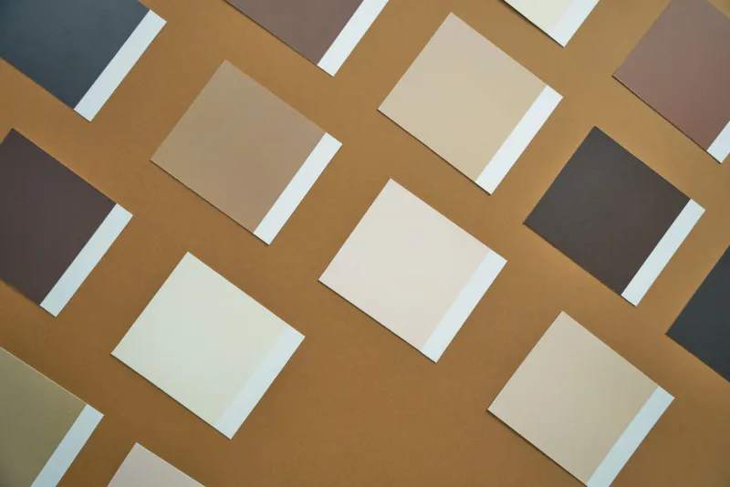
Anchor with warm neutrals. Instead of reaching for cool grays or stark whites, try warm taupes, creamy off-whites, and sandy beiges as your neutral base. They play beautifully with both earth tones and warm greens.
Push your saturation — selectively. The maximalist earth trend isn't about using every color at full blast. It's about choosing one or two tones to really commit to while keeping the rest of the palette more restrained. The contrast is where the magic happens.
Revisit your color history. Look at American design from the 1940s through the 1970s — WPA posters, vintage packaging, mid-century advertising. There's a treasure trove of sophisticated, culturally resonant color combinations sitting in that archive waiting to be reinterpreted.
Test on texture. One reason earth tones are so compelling right now is that they look incredible on textured surfaces — paper, fabric, concrete. If you're working digitally, experiment with adding subtle texture to your backgrounds and see how it changes the way your palette reads.
Color trends are never just about aesthetics — they're about what a culture is feeling and reaching for at a given moment. Right now, American design seems to be reaching for warmth, depth, and a sense of rootedness. That's not a bad thing to aim for.