Drawn from the Ground Up: How America's Cities Are Shaping Entirely Different Design Languages
Ask a designer where they're from and you'll often learn something about how they work. Not always — talent and influence travel, and the internet has done a thorough job of homogenizing certain corners of visual culture. But spend enough time looking at the illustration and design work coming out of different American cities and regions, and patterns start to emerge. Distinct visual dialects, shaped by local history, economy, climate, and community, are very much alive and evolving across the country.
This isn't just an interesting observation. It's an argument for why regional identity in design matters — not as a novelty, but as a genuine creative resource.
New York: The Editorial Backbone
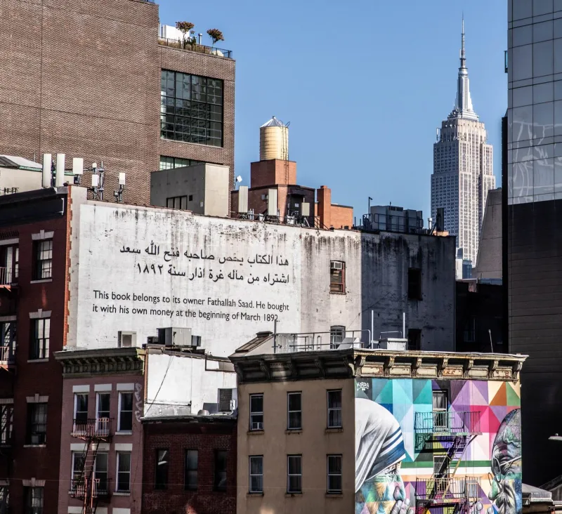
New York's design identity is almost impossible to separate from its publishing and media history. Decades of magazine culture — The New Yorker, New York Magazine, the golden era of editorial illustration — have left a deep imprint on how designers in the city approach their work. There's a sophistication and conceptual rigor to a lot of New York illustration that reflects those roots. Ideas matter here. The image has to do more than look good; it has to say something.
"New York trained me to think in concepts first," says Queens-based illustrator and art director Yolanda Baptiste, who has contributed to several major publications. "The image is almost secondary to the idea behind it. That's the culture here."
That editorial sensibility shows up in the city's thriving independent zine scene, its gallery culture, and its commercial design work alike. There's a baseline expectation of intellectual engagement that permeates the creative community — and it produces work that tends to be sharp, layered, and referential.
Austin: Where Tech Meets Weird
Austin's design scene is a fascinating collision of influences. The city's long-running identity as a counterculture creative hub — "Keep Austin Weird" is more than a bumper sticker; it's a civic value — has been increasingly complicated by the influx of tech industry money and talent over the past decade. The result is a design community that's genuinely wrestling with its own identity in real time.
What's emerging from that tension is interesting. Austin illustrators and designers are increasingly blending hand-drawn, organic aesthetics with slick digital execution — a visual metaphor for the city itself. There's a lot of work coming out of Austin that feels simultaneously DIY and polished, rooted in local culture but technically sophisticated.
"The tech boom brought resources and clients, but a lot of us are very intentional about not letting it flatten our aesthetic," says East Austin-based designer and muralist Darius Cole, whose large-scale public work draws on Texas folk art traditions and contemporary street art. "The weirdness is a feature, not a bug. We protect it."
Los Angeles: Entertainment's Aesthetic Gravity
LA's design identity is almost inevitably shaped by its proximity to the entertainment industry. The city produces enormous amounts of visual content in service of film, television, music, and gaming — and that gravitational pull influences even designers who work in adjacent or unrelated fields.
The result is a design culture that tends to be comfortable with spectacle, with narrative, and with visual storytelling at scale. LA illustration often has a cinematic quality to it — a sense of mood and world-building that goes beyond surface decoration.
But there's another LA design story that gets less attention: the city's extraordinarily diverse communities have produced distinct visual traditions that are increasingly finding mainstream recognition. Chicano graphic design, with its roots in East LA, has had a profound influence on American visual culture broadly — from lowrider aesthetics to the bold typography and iconography of the Chicano art movement. Young designers in LA are actively drawing from and extending that legacy.
"There's a whole visual language here that didn't come from art school," says Boyle Heights illustrator and designer Sofia Medrano. "It came from the streets, from community organizing, from celebration. I feel a responsibility to carry that forward and make it visible."
Detroit: Grit, Revival, and Visual Honesty
Detroit's design community is one of the most compelling — and underrepresented — in the country. The city's industrial history, its economic hardship, and its ongoing cultural renaissance have produced a design aesthetic that values directness, durability, and authenticity above almost everything else.
There's very little pretension in Detroit design. The work tends to be bold, functional, and grounded in the city's real experience. It's also deeply community-oriented — a lot of Detroit's most exciting design work happens in service of local organizations, neighborhood initiatives, and cultural institutions rather than for national brands.
"Detroit designers have always had to do more with less," says Midtown-based illustrator and community artist Keisha Drummond. "That constraint produces a kind of creativity that's hard to manufacture. You learn to make things that actually work, that actually mean something to the people they're made for."
Drummond's own work — large-format prints and murals celebrating Detroit's Black cultural history — exemplifies the way local identity and design practice can become inseparable.
The Pacific Northwest: Quiet Intensity
Portland and Seattle share a design aesthetic that's harder to pin down than some of the other regional identities on this list, but it's unmistakably there. There's a quietness to a lot of Pacific Northwest design — a tendency toward introspection, natural imagery, and carefully considered craft that reflects the region's culture and landscape.
Illustration coming out of the Pacific Northwest often has a hand-rendered quality, even when it's entirely digital. There's an emphasis on texture, on organic forms, on the kind of visual patience that suggests the designer wasn't in a rush. It's a counterpoint to the high-energy maximalism happening in some other parts of the country, and it has its own distinct power.
Why This All Matters
It would be easy to look at regional design identity as a quaint concept — something that mattered more before Behance and Instagram connected every designer to every other designer in real time. But the opposite seems to be true. In an era when so much design looks the same regardless of where it was made, work that's genuinely rooted in a specific place and community stands out.
Regional identity isn't a limitation. It's a competitive advantage — and more importantly, it's a form of honesty. Design that comes from somewhere, that carries the marks of a real place and a real community, tends to communicate in ways that generic, placeless work simply can't.
America's creative map is full of these distinct visual languages, many of them still developing, many of them coming from communities that the mainstream design world is only beginning to pay attention to. That's not a problem to be solved. It's a story worth following closely.